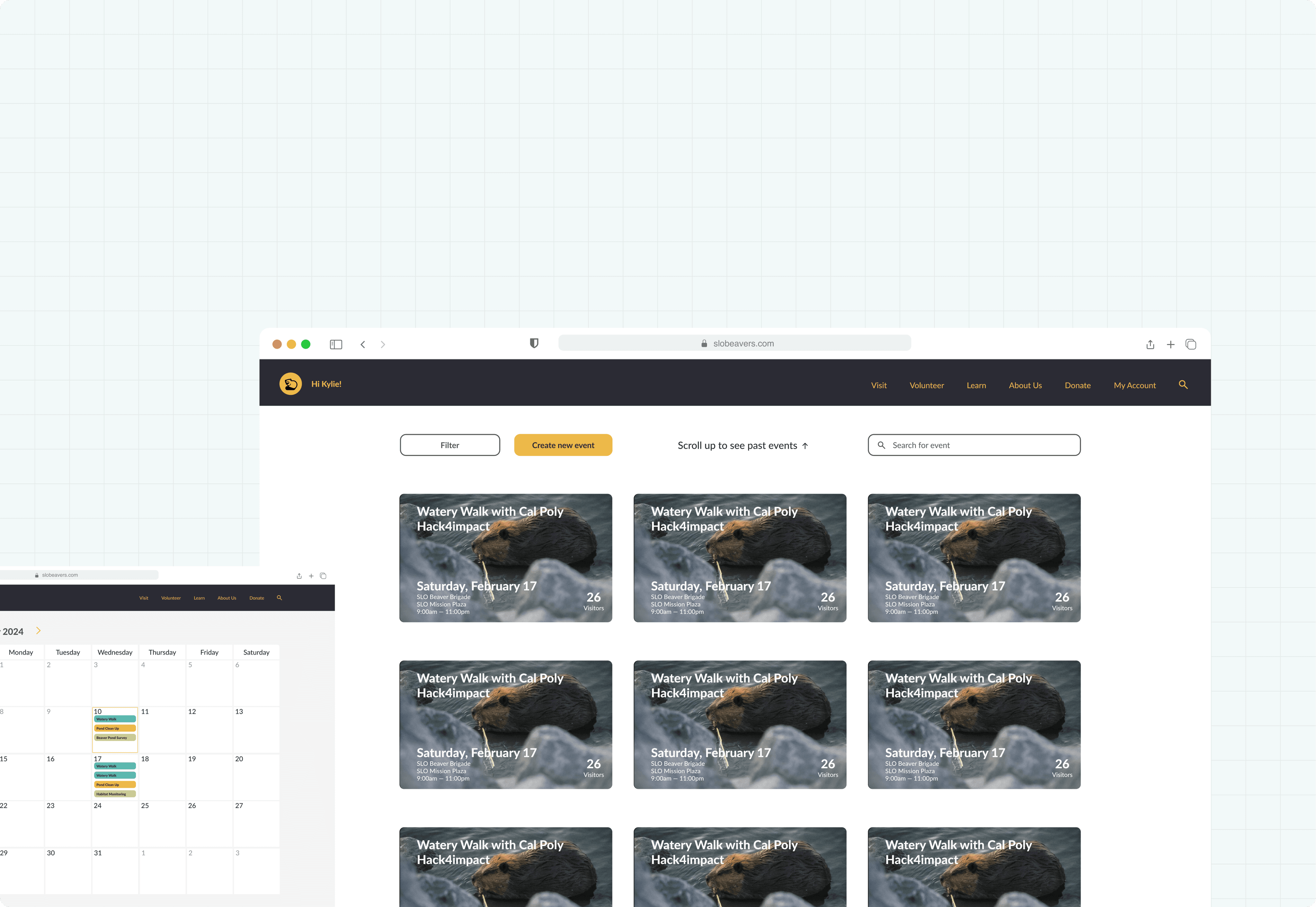
Before our partnership, prospective volunteers would fill out an interest form with their contact info and availability. Then, an admin from the SLO Beaver Brigade would reach out and coordinate a specific time for them to come in.
Signing a waiver was another bottleneck in the process to start volunteering, since this had to be done in person and on paper, leading to thick file folders that made it hard to quickly dig up specific information.
As a nonprofit, the SLO Beaver Brigade frequently applies for grants to sustain their daily operations, and a key metric they use in these applications is the number of hours their volunteers accumulate. This process was also being carried out on paper, which again made it difficult to reference specific information at any given time.
- Audrey Taub, admin
What pain points can we help you address with this web app?
What are some important features that you would like to see in the web app?
What impact are you hoping the web app will have on your organization as a whole?
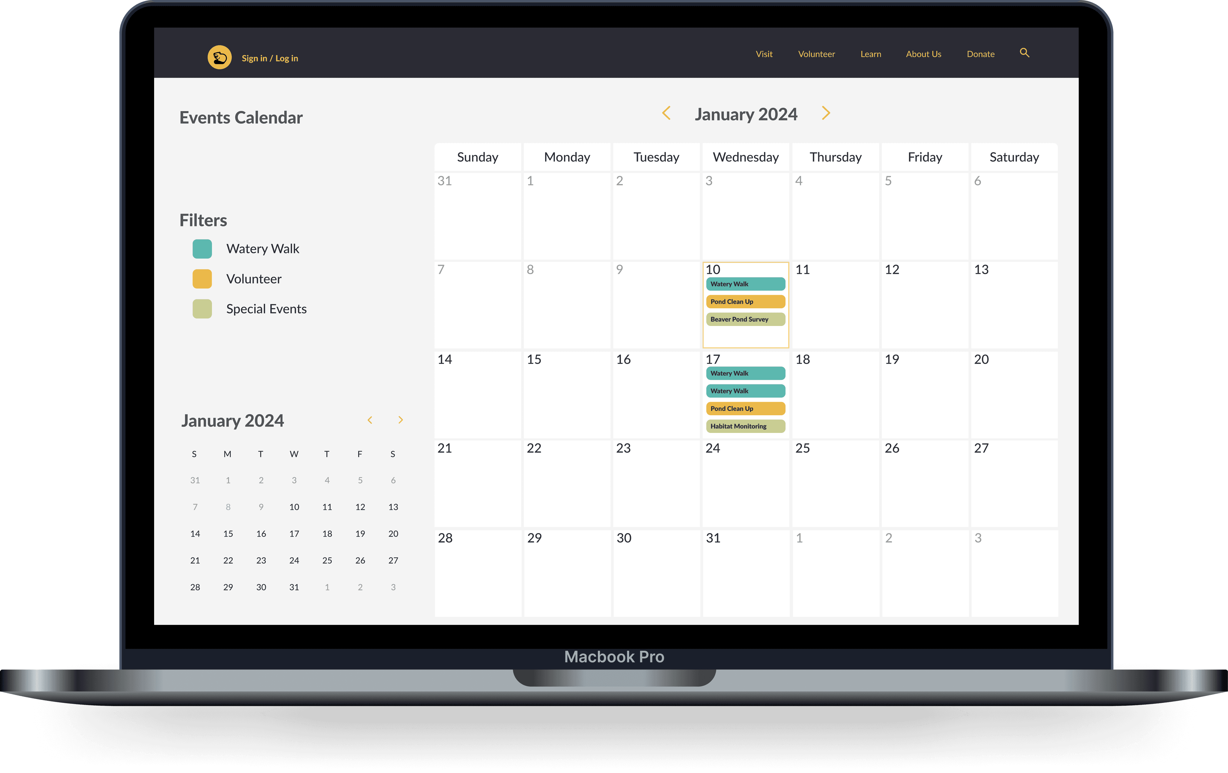
We then worked together to form a PRD. Based on this document, we knew we would be making some kind of calendar system for signing up for events, as well as a dashboard where those events could be managed.
Additionally, we knew our web app should support digital waivers, as well as some kind of digital tool for tracking volunteer hours. This was good news, because from the very beginning we knew we were addressing all three of those major pain points mentioned above.
After some initial brainstorming with the other designers, we circled back with the admins three more times to conduct user interviews and get a better understanding of each feature's functionality. Some of our questions from these rounds were the following:
How are users signing up for events at the moment?
How does the waiver signing process work and how could it be improved?
What kinds of different volunteering opportunities are users signing up for?


COMPETITIVE ANALYSIS
Since we knew the dashboard and calendar were going to be the two major interfaces for our web app, we took a look at other industry standard calendar apps like Google and Apple Calendar to ensure that our design would seem familiar to users.
Along the way, I noticed Calendly checked all the boxes in terms of functionality for our project (ability to change event type, email reminders, etc.)
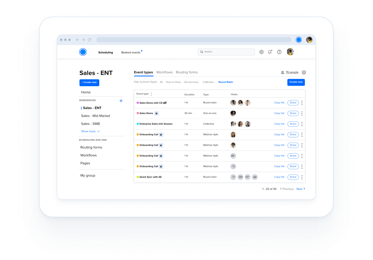
I was advocating for embedding their software into our web app until we read about the monthly subscription cost end decided to scrap the idea. This ended up working in our favor because we were able to link our custom dashboard to the calendar system we ended up building.
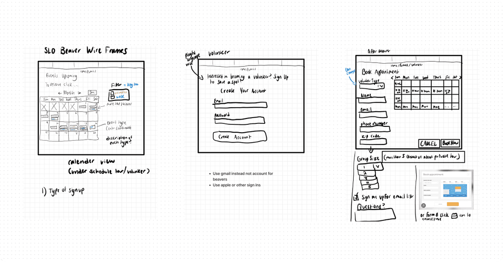
To kickstart our creativity, we made some quick sketches that we imported into a FigJam board for ideation. The main goal here was to experiment with how best to implement some of the core features from the PRD, including the option to create an account, a filter for event type, and so on.
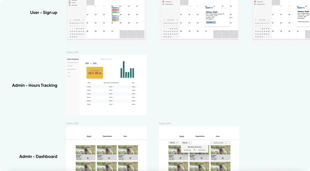
As we moved into low and mid fidelity, we ran into a lot of questions related to how the user would navigate the web app, such as should they be required to have an account in order to register for an event? In order to simplify the registration process as much as possible, we agreed that an account would be optional.
Another somewhat daunting task was creating an authentication system for the volunteer hours. In order to ensure that volunteers were being awarded the correct number of hours, designed the tracking tool to automatically add the number of hours equal to the duration of the event to the corresponding user profile.
Then, admins would be allowed to manually adjust the number of hours if a volunteer didn't show or the event was canceled or modified.
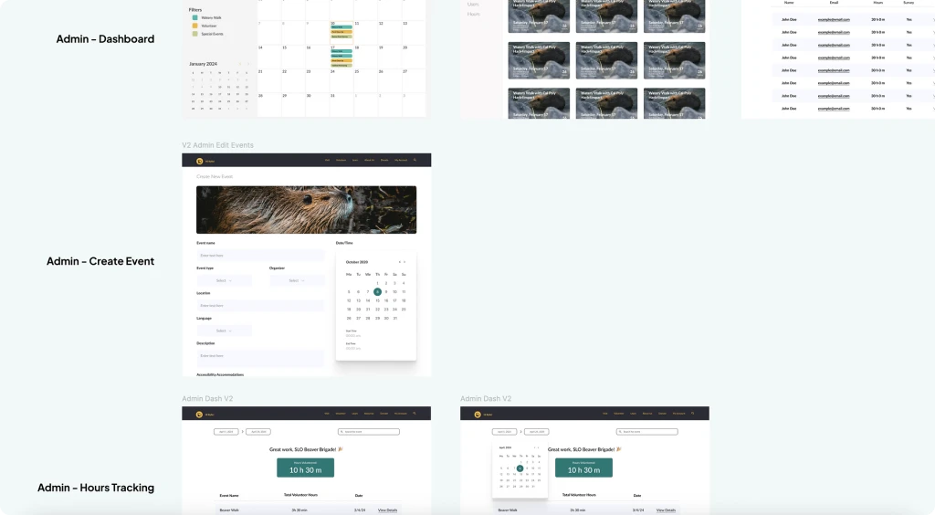
A big challenge that we tackled in the final iterations of the project was the inconsistent branding. With a team of four designers all working on separate components, the typography, color scheme, and content hierarchy were commonly mixed up. In our final iterations, we were able to consolidate many of our ideas into something more consistent.
Something new we tried this year that I really enjoyed actually was getting to work 1:1 with the devs. Previously, the tech leads had been assigning devs individual tasks in GitHub usually involving a single component like the pop-up modal on the calendar.
This time around, the designers and I had the opportunity to sit down next to the devs as they coded, allowing us to take on more of a quality assurance role. This meant ensuring the right hex code values were used, font sizes and border radius, etc.
We were able to digitize three recurring processes, future-proofing that information.
We helped a new nonprofit streamline their workflow.
We found a way to contribute social good to our community.
While the team spirit for this project was off the charts (go beavers! 🦫), there were still some areas where we fell short.
Communicate with the devs CONSTANTLY. During this project, the developers worked very efficiently and occasionally were assigned GitHub tasks that involved components that the designers hadn't built yet. This sometimes led the devs to create their own designs, and put us in the uncomfortable position of needing to choose between designing around what they had made or asking them to scrap their idea.
Advocate for your ideas. During this project, there was limited communication between the designers and the developers. As a result, the web app that was ultimately developed in code wasn't exactly 1:1 with the Figma file.
Stay informed on designs that others were assigned as well. I often felt disconnected with the other designers on this project because there were four of us and four major components that needed to be built (admins/user dashboard, calendar, hours tracking), so it made sense to have everyone work on mostly one feature. This was a major contributor to the inconsistent branding and made it feel like I was always a little out of the loop.